Ep. 82: David Schwarz of HUSH Studios
Experience designer David Schwarz grew up “seeking weird things to explore, make and build.” Fast forward to adulthood and he’s still at it. As co-founder of Hush Studios he spends his brain power and energy blending architectural space and digital technology to create installations and experiences that people can inhabit, learn from, play in, and feel things inside of. He arrived via detours in economics and the San Francisco tech boom. It’s not a straight line, or clean story but it’s a fascinating one!
Follow David’s work at heyhush.com and on Instagram, Facebook and Twitter.
What is your earliest memory?
In kindergarten I became totally obsessed with this thing called a “number roll.” I’m not sure if I came up with it, or it was something that was shown to me by my teacher, Mrs. Albers. It started with a long, thin strip of graph paper onto which I started writing numbers sequentially into the grid, square by square, line by line, top to bottom, beginning with zero. Once I completed the paper, I taped a new one to it end-to-end and began numbering where I left off. In itself, that’s not so weird for a kindergarten student who is learning numbers. But I remember that I continued to do this every day for the entire school year. Writing. Taping. Rolling. Writing. In the end, the roll was about two feet in diameter and was up in the 100,000s… I remember both the act of writing and the big, awkward, taped-together object so well, it’s as if I can still feel it in my hand.
Also: in that same class, ostensibly on a break from number-rolling, I blew red glitter into a student’s eyes by accident and he had to go to the hospital. He was ok. If he’s reading this, sorry, again.
How do you feel about democratic design?
It’s hard not to believe in the core principles of democratic design - form, function, sustainability, quality and accessibility. Why would we want to bring anything into the world that isn’t beautiful in form, useful, made from materials that are good for the Earth and have a future plan, and obsessive about detail? But does “accessibility” conflict with niche, luxury or artistic design work? Our design goals at HUSH are built on beauty, information, and uniqueness. Is that necessarily in conflict with the broad paradigms of democratic design? Our clients are primarily large, dynamic corporations and their audiences are niche, and incredibly tuned in to the ecosystems, languages, subject matter of these particular organizations. Does that mean democratic design can’t exist in these niches? It’s a poignant intersection to consider.
There are examples of where super-focused, unique design work can leverage democratic design principles. For example, an artist/architect dreaming of the most beautiful-yet-functional built environment must still adhere to reasonable standards of accessibility and interaction. Thomas Heatherwick’s “ Vessel” in Hudson Yards might be a good experiential design reference. Ultimately, it’s a public sculpture, an inhabitable, destination experience. It’s visionary in its unique form, proportion and scale. But it’s intended to be publicly accessible, functions to attract the Bell curve of visitors and provides a unique, albeit Esher-like, experience.
So, this balance between uniqueness/artistry/beauty and democratic accessibility can likely be achieved at some level. At HUSH, we’re working on similar expansion of our practice, undertaking several public arts proposals and some public/private experience design. Two current projects are actually squarely in the public realm (albeit privately financed) and accessible to the public at a scale where they’ll be seen by hundreds of thousands of daily commuters. I can’t wait to see them come to life.
What’s the best advice that you’ve ever gotten?
Be the best “you” you can be, because that’s all you got.
I think we spend a lot of our youth modeling ourselves around others - friends, teachers, coaches, family members, rockstars, etc. It’s simply easier to look at someone else and their accomplishments or behaviors and try to parrot them instead of looking inward. As I’ve gotten older, and in relationship to the advice above, it’s become incredibly clear that the quicker we understand our unique gifts and embrace what we’ve been given, the faster we’ll find calm, success and a kind of flow state for our personal and professional happiness. Anything else creates friction.
Also, when I was 21, Richard Meier told a group of us soon-to-be architecture students to stay away from the field entirely as it’s “totally broken.” Thank you, Richard.
How do you record your ideas?
Notebook. Nothing sticks in my brain unless it’s handwritten or drawn. Once I commit it to visual form, as a doodle or a few scribbled words, I can remember it perfectly. It’s the visual record that allows it to stick.
More specifically, I have a really nerdy methodology for idea generation, information recording, and task management. None of it is digital. First, I buy a huge stack of Muji notebooks - the small, portrait oriented, pamphlet size soft cover once that have about 50 pages each. Also, I need a really new pen where ink flows readily. It can be a cheap pen, it just needs to be full of ink.
I record notes and visual ideas front-to-back. Other than a standard title and date, the rest looks like word clouds, sketches, diagrams, schematics, asterixis and circles connecting ideas. Conversely, tasks and to-dos happen back-to-front. I split these pages into a right half and left half. On the right, I list low-level tasks that need to get done but aren’t critical to broader success. On the left half of the page are a list of “musts” which are the things that are the most important, most pressing and will have the most business and/or personal impact. This helps me focus on the “musts” before anything else so that I can overcome the natural mental blockage of avoiding life’s biggest hurdles. Checking off simple tasks creates a small endorphin rush - but over time, none of those little tasks will move the needle on overall success. That’s why you have to attack the big stuff first.
Notebook with task management system
What’s your current favorite tool or material to work with?
Frosted acrylic is floating around the studio these days. There are materials that I’m more in love with, that have more tactile value or precision. But, acrylic is serving an important purpose right now. A theme in our work is the idea of “softening” the feeling of digital. We’re pretty vocal that more digital screens is the not the answer to our experiential future. Screens are cold, technical, impersonal, and we see and touch them all day already. We often play with the idea of “de-resolution” or “de-rezzing” digital so that the primary means of experiencing digital is actually through something material. This allows for the best of digital to shine (in motion, constantly changing and updatable, relevant, full color spectrum, real-time, etc.) and combine with the best of materiality (creates a patina that can truly mesh with the architectural surroundings and finishes, etc.)
Frosted acrylic is one such “de-rezzing” material. You can see this is some of Jim Campbell’s work, for example. Similarly, we’ve used dichroic and architectural glass, milled wood, polished stainless steel, for similar “softening” effects. When placed in front of a digital surface, these materials soften the digital-ness of it, humanizing the content in some way. It’s no longer “pixels” of information - it’s just light.
United Therapeutics “Energy Dial”
United Therapeutics “Energy Dial” in building atrium
Google “Deep City” NYC HQ experience
Google “Deep City” NYC HQ experience detail
Nike NYC Retail Flagship installation detail
What book is on your nightstand?
The stack is high. Some I’m part way through and some are in the queue. I get a lot from my wife’s nightstand, so I have a nice pipeline of reading. Unfortunately, at night I fall asleep after about 15 pages so it’s slow going. Vacations and plane flights help.
Professional:
Flow: The Psychology of Optimal Experience by Mihaly Csikszentmihalyi
This is a fascinating look on the psychology of our minds and what makes us super efficient in our work and play. How do we design our environments and processes to optimize the flow state that makes us most productive, most efficient, and most importantly, most happy.
Never Split the Difference: Negotiating As If Your Life Depended On It by Chris Voss
Personal:
This was just such a fun read. It’s a couple of years old now, but I think it still captures the zeitgeist of this moment so well. Each character is incredibly written and it’s as if Hill can embody anyone. Interestingly, the book ends with a message of empathy, encouraging us to be open to perspectives of others. In it, one of the characters argues that it’s impossible to be truly empathetic to anyone because it would require actually occupying their being - and since we’re always outsiders to someone else - true empathy may be impossible. However, the book actually generates empathy over the course of it’s 700+ pages and characters who I resisted early on become endearing and understood in full by the end. It’s an interesting meta-journey.
The Writing Life by Annie Dillard
My Struggle: Book Six by Karl Ove Knausgaard (the sixth book of the series that I’ve read)
The Last Days of Night: A Novel by Graham Moore
The Power Broker: Robert Moses and the Fall of New York by Robert A. Caro
Why is authenticity in design important?
I am often reminded that the world doesn’t need more “stuff.” As designers, this puts us in a perilous position. Do nothing (hard to make a living) or do something (but add more stuff to the world). Authenticity in design helps to ensure that what we are making is thoughtful and considerate of a design’s indefinite future. If authenticity remains as a litmus test for what we make, then we can be sure that our intentions are true.
Personally, authenticity has a lot to do with our firm doing what we intended to do at the start - and to raise a flag if we are drifting off course for any reason, internal or external. We are often more critical of our work than our own clients and we often take the harder road because “harder” usually delivers “better” - that’s an authentic pursuit of a vision and a relentless focus on the goals we set forth for our team and our clients.
Favorite restaurant in your city?
Fortunately, New York presents so many options that this question is instantly perplexing. It’s a good problem to have. To simplify, I’ll give a shout out to my neighborhood favorite in Fort Greene, Brooklyn: Roman’s. For backstory, there was recently a great article in the NY Times about the founder’s history as a Brooklyn restaurateur before Brooklyn was “Brooklyn” and Williamsburg in particular, was the blueprint for every hipster neighborhood from Shoreditch to Palermo Soho.
What might we find on your desk right now?
A beautiful, faceted design object created just for us by one of our talented creative leaders, Dev Harlan, who has his own art practice.
Object from the “Rhombic Triacontahedron Series” by Dev Harlan
Water. My wife bought me a nice water carafe for my desk because sometimes I focus so much, for so long, I forget to hydrate - and then I come home thirsty and angry.
This book: Allan Wexler: Absurd Thinking-Between Art and Design by Ashley Simone
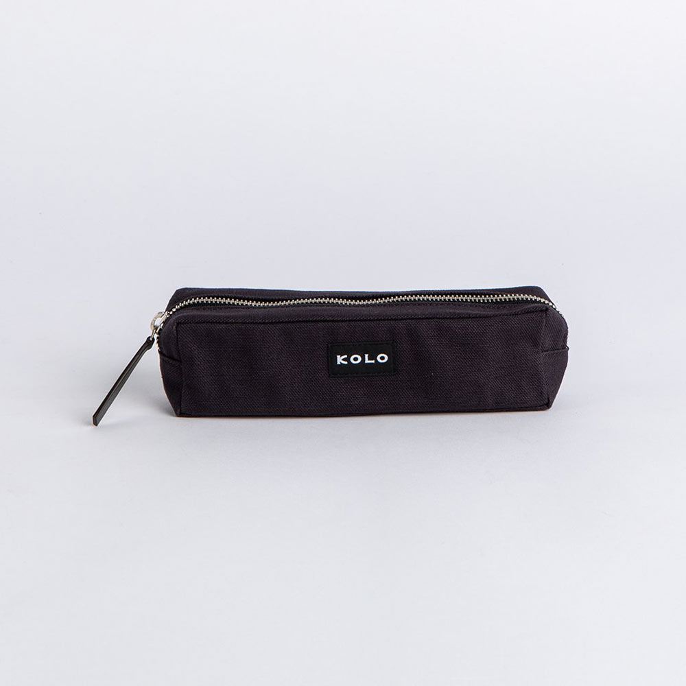
This KOLO pencil case. I like to use a lot of pens in different colors to help organize and outline my thoughts.
Who do you look up to and why?
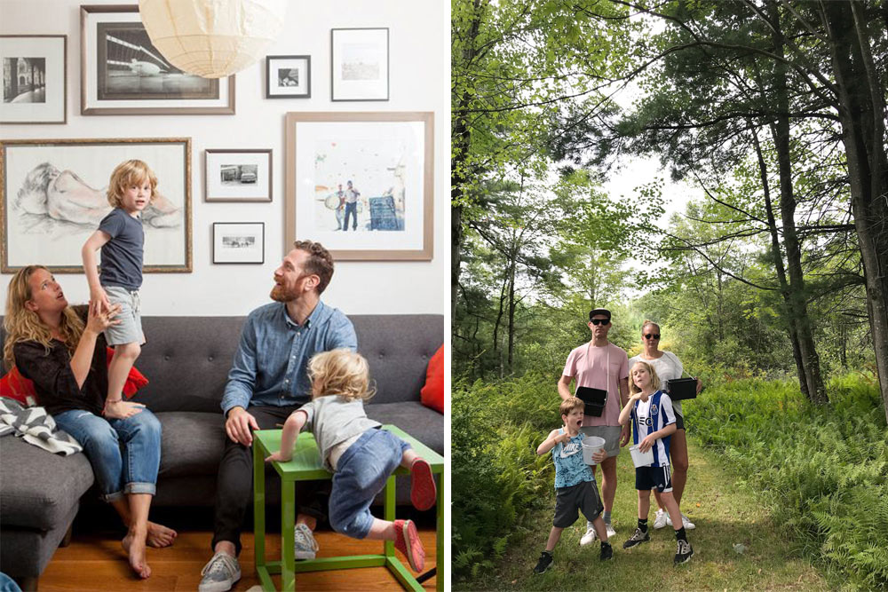
My wife. She seems to have a perfect understanding of what makes her happy and a self-awareness that drives her to do what she wants, when she wants, in order to satisfy that pursuit. When she reads this, she’ll laugh, as I know she has her own internal conflicts and self judgments. But, when we all struggle to balance what life requires of us and what we require out of life, she seems to do it with ease. Somehow, she seems to be unphased by the hard stuff and in a relentless pursuit of the fun stuff. In that way, I think she has wisdom beyond her years and a moral compass that points true North all the time.
Kristen and David
What’s your favorite project that you’ve done and why?
I’ll answer politically (lest I disappoint any of our clients) by talking about one of the most recent projects we launched and why it has some very unique aspects that certainly puts it in the running as “a” favorite.
As any business, we evaluate our opportunities very strategically. However, as a creative firm, we put “creative potential” front and center. This is followed by the type of subject matter (what do we want to learn about?), client relationship (do they share our cultural values?) and long term growth potential (are they looking to develop a creative partnership into the future?) We’ve been fortunate to work almost exclusively on projects that really blend all of these strategic values.
The project we recently completed with United Therapeutics, a biotech firm based in Silver Spring, MD was a penultimate example of the above. Martine Rothblatt, United Therapeutics’ CEO is a visionary by anyone’s standards. She literally had a “dream” one night to build a sustainable, site net-zero energy building on her campus. Her rationale was simple: her company builds biotech products that save lives so if they are going to build a new building, it better help to save the world too. After some incredible work by architectural and engineering partners, her dream grew to extend into HUSH’s world: she wanted the building to be able to “speak” to its occupants, telling its story about the way technology and humanity can coexist to help us minimize our environmental impact. Through an amazing, rigorous and insightful journey with Martine and her team, we delivered on her vision.
We believe in the subject matter and focus on sustainability. Martine and her team are dedicated and passionate, and envision a future state that only few can even comprehend. We continue to build our relationship, helping UT articulate its values through unconventional and unique design.
What are the last five songs you listened to?
Looking at my Spotify history, it’s clear that the controls have been passed around my family in the past few days. Here’s the round up:
Bohemian Rhapsody by Queen (after a we watched Rami Malek’s awesome performance in the recent film and Wayne’s World in the same week)
Stone Cold Crazy by Queen (just so my kids would also know that Queen could crank it out when they wanted to)
Sunflower by Post Malone (kids’ favorite from the Spider-Verse soundtrack)
Spanish Stroll by Mink DeVille (from Season 3 of the High Maintenance soundtrack)
Almeda by Solange (been waiting for this album after seeing her show and her awesome stage design)
Clever is produced by 2VDE Media. Thanks to Rich Stroffolino for editing this episode.
Music in this episode courtesy of El Ten Eleven—hear more on Bandcamp.
Shoutout to Jenny Rask for designing the Clever logo.


